[PT-BR]
Sobre
Dra. Raquel Boechat é uma médica dermatologista residente de Niterói, Rio de Janeiro. Dentre os principais procedimentos realizados pela dra., estão: preenchimento, harmonização facial, peeling químico, botox, dentre outros.
[EN]
About
Dr. Raquel Boechat is a dermatologist resident in Niterói, Rio de Janeiro. Among the main procedures performed by Dr. are: filling, facial harmonization, chemical peeling, botox, among others.

[PT-BR]
Conceito
Para a criação do logo da Dra. Raquel Boechat, buscou-se representar elementos da natureza, que é uma forte aliada dos cuidados com a pele.
Os elementos escolhidos para compor o logo são, além das iniciais "R" e "B": borboleta, folha e copo de leite (flor).
[EN]
Concept
For the creation of Dr. Raquel Boechat's logo, we sought to represent elements of nature, which is a strong ally of skin care. The elements chosen
to compose the logo are, in addition to the initials "R" and "B": butterfly, leaf and glass of milk (flower).

[PT-BR]
Logo
Formado por linhas finas e consistentes, sinônimos de pele saudável e bem cuidada, o logo criado para a Dra Raquel Boechat. possui traços que formam implicitamente as letras R e B. Há também a representação da metade de uma borboleta e suas asas, símbolo de beleza na natureza. As asas do logo podem ser identificadas também como folhas.
Olhando o símbolo (logo) ao virar a cabeça em 90º para a direita, toda a forma criada pode também se assemelhar a uma flor copo-de-leite, e a escolha para a representação dela se dá por ser uma flor durável e bonita, que floresce ao longo de todo o ano, é sensível ao calor e necessita de muitos cuidados para mantê-la preservada e saudável sempre, assim como a pele humana.
A junção de todos esses atributos e significados resultam num símbolo único, delicado e o mais importante, que representa muito bem a profissional Dra. Raquel Boechat e seu trabalho.
[EN]
Logo
Formed by fine and consistent lines, synonymous with healthy and well cared for skin, the logo created for Dr Raquel Boechat. it has lines that implicitly form the letters R and B. There is also a representation of the half of a butterfly and its wings, a symbol of beauty in nature. The logo's wings can also be identified as leaves.
Looking at the symbol (logo) when turning the head 90º to the right, the entire shape created can also resemble a calla lily flower, and the choice for its representation is because it is a durable and beautiful flower, it blooms throughout the year, is sensitive to heat and needs a lot of care to keep it preserved and healthy at all times, just like human skin.
The combination of all these attributes and meanings result in a unique, delicate and most important symbol, which very well represents the professional Dr. Raquel Boechat and her work.

[PT-BR]
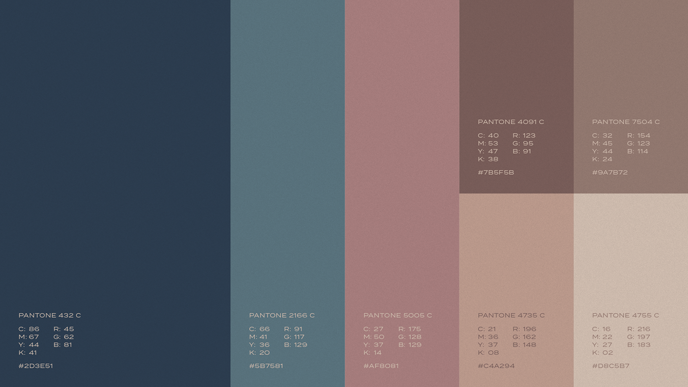
Cores, Tipografia e Identidade Visual
Para compor a paleta de cores, uma sequência de vários tons de nude (que se assemelham a variedade de tons de pele), foi criada. Há também os tons em rosegold e azul petróleo, que formam um lindo contraste com as cores mais quentes e delicadas. A escolha dos tons de azul se deu a partir da ideia de que a pele precisa de cuidados calmantes, e na psicologia das cores, o azul desempenha exatamente essa função.
A fonte principal escolhida é sofisticada, e ganha ainda mais destaque com as variações compostas pela “família”. Em contraponto, foi escolhida uma fonte secundária cursiva, para trazer delicadeza e contraste para as composições tipográficas.
Unidos, todos esses elementos resultam numa identidade visual delicada, com variadas possibilidades de desdobramentos para a Dra. Raquel Boechat.
[EN]
Colors, Typography and Visual Identity
To compose the color palette, a sequence of various nude tones (which resemble the variety of skin tones) was created. There are also shades of rosegold and oil blue, which form a beautiful contrast to the warmer, more delicate colors. The choice of blue tones was based on the idea that the skin needs soothing care, and in the psychology of colors, blue performs exactly that function.
The main typo chosen is sophisticated, and gains even more prominence with the variations composed by the “family”. In contrast, a secondary cursive typo was chosen to bring delicacy and contrast to the typographic compositions.
Together, all these elements result in a delicate visual identity, with varied possibilities for developments for Dr. Raquel Boechat.